Choosing a Brand Color and Visual Identity
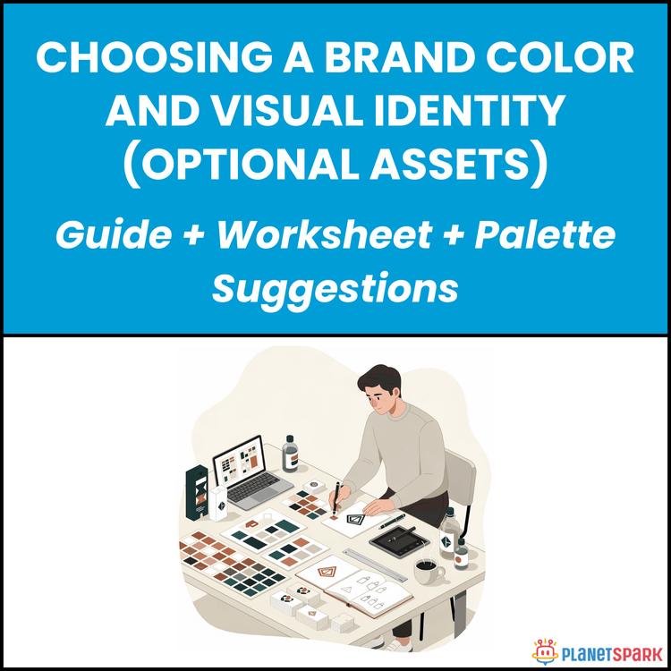
Choosing a Brand Color and Visual Identity
Choosing a Brand Color and Visual Identity and Make Your First Impression Digitally
Your expertise might be strong — but does your professional presence reflect it?
In today’s digital-first world, your visual identity speaks before you do. Whether someone visits your LinkedIn profile, downloads your resume, views your presentation, or lands on your personal website, visual consistency shapes their first impression within seconds.
Many professionals overlook this. Their profiles, documents, and online assets feel disconnected — different colors, inconsistent fonts, no visual structure. The result? A diluted brand presence.
That’s why the resource “Choosing a Brand Color and Visual Identity” was created. It helps working professionals build a simple, cohesive visual system that strengthens credibility, clarity, and recognition across platforms — without needing design expertise.
This guide turns visual branding from something overwhelming into something structured and practical.
Who Is This Resource For?
This resource is especially valuable if you are:
- A working professional with 0–15 years of experience
- Building a personal brand on LinkedIn or other platforms
- A consultant, coach, or freelancer creating client-facing assets
- Preparing to launch a portfolio, website, or digital presence
- Transitioning careers and redefining your positioning
- Someone who wants a more polished and consistent professional image
If you want your professional presence to look intentional rather than accidental, this guide provides a clear roadmap.
What Does This Resource Contain?
This is not a graphic design manual. It is a structured branding clarity system.
Inside the resource, you will find:
- A clear explanation of why visual identity matters for professionals
- A brand personality alignment exercise
- A framework for selecting a primary and secondary brand color
- Guidance on understanding color psychology in professional contexts
- A simple typography selection structure
- Visual consistency rules for LinkedIn, resumes, presentations, and documents
- Examples of cohesive vs inconsistent professional branding
- A minimal asset checklist for personal brand foundations
- A step-by-step worksheet to define your visual identity
- A consistency audit checklist before publishing content
Everything is designed for practical implementation using easily accessible tools.
Summary of the Resource
“Choosing a Brand Color and Visual Identity” is a step-by-step guide that helps you build a clear, consistent visual presence aligned with your professional positioning.
It simplifies branding into manageable decisions — helping you select colors, fonts, and layout standards that reflect your credibility and expertise.
Instead of guessing what looks “professional,” you’ll have a defined system you can apply everywhere.
How Will This Resource Be Useful?
After applying this guide, you will:
- Create a more polished and consistent professional image
- Strengthen recognition across digital platforms
- Align your visuals with your career positioning
- Improve perceived credibility and authority
- Build confidence in how your professional materials look
- Avoid random or inconsistent design choices
Visual consistency reinforces trust. When your branding looks intentional, your expertise feels stronger.
How Should You Use This Resource?
To get the best results, follow this approach:
First, complete the Brand Personality exercise to clarify how you want to be perceived — strategic, analytical, creative, authoritative, approachable, or innovative.
Second, select one primary brand color that aligns with your positioning.
Third, define 1–2 supporting colors and a simple typography structure.
Fourth, apply your selections to your LinkedIn banner, resume template, presentation slides, and other professional assets.
Finally, conduct a consistency audit using the provided checklist to ensure alignment across platforms.
Revisit this guide whenever your positioning evolves or you pivot in your career.
Action Steps
After accessing this resource, take these immediate steps:
1. Block 90 focused minutes
2. Complete the Brand Personality alignment worksheet
3. Select one primary and one supporting color
4. Define a consistent font pair for headings and body text
5. Update at least one professional asset (LinkedIn banner or resume)
6. Create a simple brand reference note for future use
Strong professionals deserve strong presentation.
Your visual identity is not about decoration — it is about alignment and consistency. When your visuals support your positioning, your professional brand becomes clearer and more memorable.
Build it once. Apply it everywhere.
Book your free session today!